
From Feedback to Features: Your Customer-Approved eCommerce Experience
Traditional marketing teaches companies to think of customers as a bridge between inventory and sales. In the age of hypervisibility and technology, brands are adding resources to their marketing stack that allow them to build unique experiences instead of merely monitoring customer behavior. The most successful brands have started to rethink how their customers progress through the eCommerce funnel. For good reason, customers have the potential to become advocates, fans, and referrers of your brand. According to a recent survey conducted online by Harris Poll on behalf of Ambassador, 82% of Americans say they seek recommendations from friends and family when considering a purchase.
In fact, the company-customer relationship has undergone a noticeable shift over the last few years. Customers are no longer uninformed pawns of the marketing game, they’re key players. If your team is on the right track, you’ve already made customers an integral component of your eCommerce game plan. Let’s take a look at a few strategies that transform customer interaction into company-wide eCommerce insight.
Use smart content to make the World Wide Web a little bit smaller
Sometimes pertinent feedback doesn’t come in a form fill or a questionnaire. In fact, some of the most important information about your customers comes from easily predictable defining characteristics. Qualities like location, language, and type of device can be established well before customers even enter your website. Your brand can respond to these established facts by populating smart content on a landing page that essentially provides a unique landing page for specific customers.
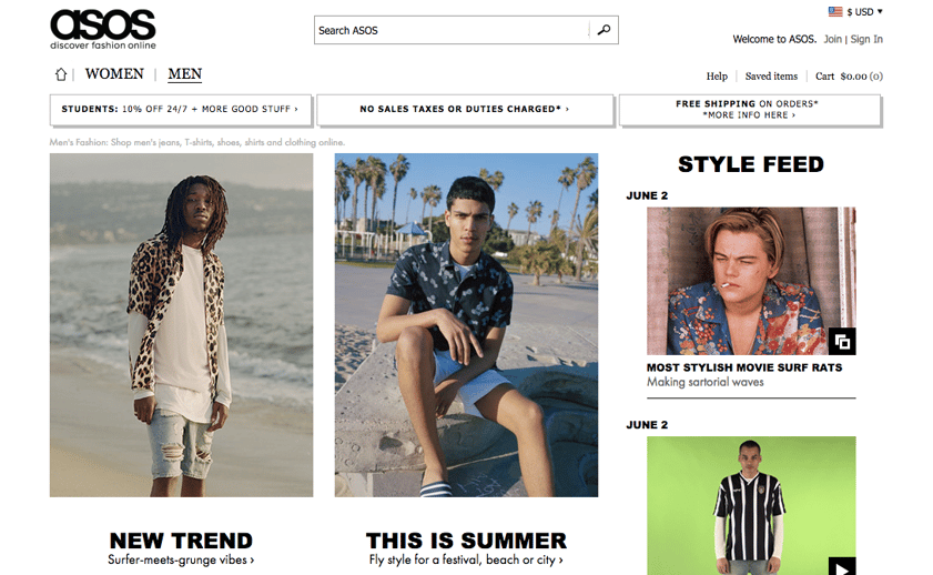
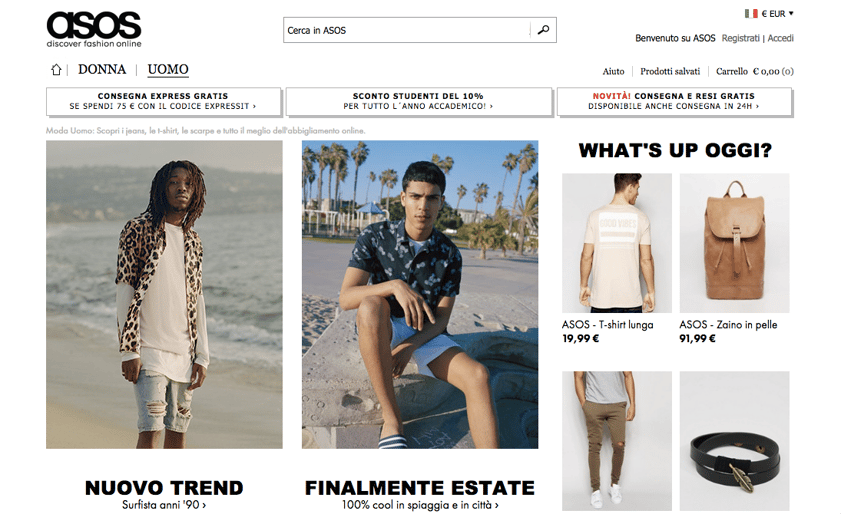
International eCommerce retailer ASOS uses smart content on its homepage that displays unique copy, images, and pricing based on a customer’s geographical location.
Take the unique, geographically specific homepages for ASOS customers for example. The featured clothing styles are the same, but notice the change in the website language, headers, currency, and updated modules on the right side of the page. ASOS understands that shoppers in the United States and Europe have a different set of needs and they’ve built their website to exhibit the difference. A Janrain study revealed that nearly three-fourths of online consumers get frustrated by irrelevant landing page content. Customers may encounter different landing pages, but the brand identity and purchasing process is the same. Smart content is like the welcome mat that you see as you step up to visit a good friend’s house, it invites you to take another step and hopefully stay for a long time.
eCommerce Tip: Create an active response to the idle feedback that a customer’s defining characteristics provide by using smart content. This proves that your brand is being observant from the start and carves out a unique space for customers before their initial visit to the homepage.
Perform A/B tests to create grade A features
Imagine. You’re drafting a new landing page on your site and not quite sure where to place certain modules or which copy to incorporate. There’s probably a member of your team who thinks their idea is the obvious choice and another member of the team that thinks the opposite. This is the common landing page stand-off and every eCommerce professional has been there before. The best way to remedy this situation is to determine what your website visitors (and potential customers) prefer. As hard as it is for marketers to admit, we can’t forecast every single move that customers will make. According to Econsultancy’s Annual Conversion Rate Optimisation Report, 67% of companies optimize conversion rates using A/B testing. Oftentimes, the most beneficial information can be retrieved from customer behavior.
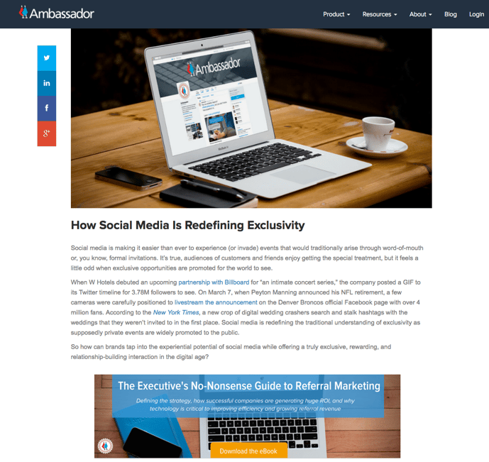
Call-to-Action ‘A’ Version
Call-to-Action ‘B’ Version
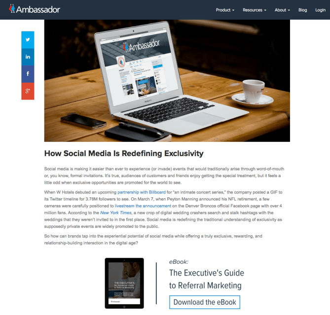
An Ambassador blog post call-to-action A/B test
Ambassador tests the different calls-to-action in the above blog post images to measure which one results in the most resource downloads. The metrics gained from the clicks on these buttons help guide how we’ll incorporate calls-to-action in future blog posts.
A/B tests transform aesthetic choices into elements that assign statistical significance to your website visitors’ preferences. Although each brand campaign will have its own set of desired metrics and customer behaviors, the results can lead your team in the right direction toward an enticing and engaging website feature. Before you get started, develop a clear set of goals for traffic and customer behavior that corresponds to a solid timeline. You’ll be able to avoid the never-ending cycle of testing then re-testing if you know what you’re looking for from the beginning.
eCommerce Tip: Chances are, your customers are already acting out their preferences and performing behaviors that you can learn from on your website. Consult your page-specific metrics and brand goals to decide which customer preferences are pronounced enough to become sitewide features for a given time.
Follow up with a favor
In the olden days, any trace of an online presence was enough to validate your business as a modern brand (or dissuade old-fashioned customers from interacting with you online). Today’s customer touch points are a bit more nuanced. In addition to a pristine website, customers have come to expect repeat email interactions. In fact, accepting a customer’s email address without sending a follow-up offer email is almost unheard of. Take this one step further by sending emails that prioritize your customer’s needs over your brand’s desire to sell product.
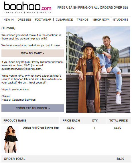
Boohoo’s attention-grabbing abandon cart email uses the customer’s first name and a link back to a specific product.
The above image displays the cart abandonment email that I received from Boohoo after leaving an item in my cart and exiting the site. Instead of assuming that I was done exploring the site, Boohoo sent a concise email explaining the following steps and directing me back to the cart to complete my purchase.
eCommerce marketing has matured beyond the customary introductory emails or post-purchase receipts. A customer-approved email responds to the unique actions that customers perform while on your eCommerce website. According to an Experian study, transactional emails generate 8 times more opens and 6 times more revenue than any other type of email.
eCommerce Tip: Diversify your email marketing strategy and approach each customer like a trusted friend that you’re looking out for. Your customers will expect discounts and company news, but they’ll appreciate a link to forgotten items or little-known information.
Your Customer-Approved Website Strategy
Technology has empowered eCommerce brands to create customer-approved online experiences that mimic the interactions that patrons would have at a traditional brick-and-mortar shop. No two customers are exactly the same, so their journey through your site and to the all-important point of purchase varies too. Your brand can start to build a customer-approved eCommerce experience by incorporating your customer’s dynamic characteristics, discovering their preferences, and sparking an organic email workflow. Trust us, your customers are paying attention. Are you?
Written by
Team Ambassador


Join the Conversation
Have a question or insight? Leave a comment below — we'd love to hear from you.